


Basics of Fontology / Typography
Font what? Fontology? Typography? What does all this mean?
Well, let’s break down the meanings of “font”, “asia”, “ology”, “type”, and “graphy”.
- “Font” – a complete set of characters of a particular style and weight which, in the days of block metal press printing, were cast or poured.
- “Asia” – to rise, in reference to the sun, or to shed light on.
- “Ology” – the science, study, or knowledge of a subject.
- “Type” – an impression, mark, or relief once set in metal or stone. This goes back to the printing blocks of metal or wood with letters carved for use in letterpress printing.
- “Graphy” – to write, express by written characters, or to draw.
So, back to the title: “Fontasia” – simply means to shine some light on a bunch of characters! In doing that, we will briefly study various components of font families – “Fontology”. Additionally, we will touch on the construction of how types are drawn so that we can better identify them – “Typography”.
Let’s get started!
Shedding Light on Font Families
Font families are subgroups of fonts or type sets. Identifying these is a huge step in communicating with your designer about text. The most common font families are Serif, Sans Serif, Script, Blackletter, and Ornamental.
Serif
Serif is a type face that has little extra strokes found at the end of main vertical and horizontal lines. Serifs can be hairline thin, square or slab, or wedge shaped. The serifs are also bracketed or unbracketed. Think of it this way – Serif fonts have hats and shoes and gloves – extra strokes and extra character.
Sans Serif
Sans Serifs are fonts without serifs; sans from the French meaning without. Sans fonts have simple, clean lines. There are several variations from fun to business. This crisp font style is very common on screen text whereas serif type is more common in printed material.
Script
Script typefaces are those designed to resemble handwriting, with styles ranging from formal to whimsical. The characters of some Script typefaces are connected. Script fonts have designs resembling that of using a variety of writing instruments, such as a brush or calligraphic pen. Script typefaces should not be set in all capital letters and are generally reserved for announcements or invitations.
Blackletter
The Blackletter classification of fonts may be referred to as Old English or Gothic. This is a style of text used by scribes throughout Latin Christendom during the Middle Ages, and used in Germany until World War II. Blackletter typefaces are ornate and complex and can be difficult to read. They are generally used for diplomas, certificates, or as initial caps at the beginning of paragraphs or chapters.
Ornamental
These are sometimes called symbol typefaces, or glyphs. Ornamental fonts can be subsets of font families. Ornamental typefaces contain decorative ornaments, pictures, or symbols for some or all of the characters. They can be used to add embellishments or add pictures to text without importing graphics or used to add mathematical or publishing notes. There are musical fonts, animals, and almost anything you can imagine:
Font Styles
Each font family can have multiple subsets of attributes, such as Bold, Italic, Condensed, Extended, and a combination or pairs of these. For instance, Avenir is a clean sans serif font family which contains characters that take on attributes such as Bold Italic Avenir, etc. Think of it like your family. You may all have the same sir name but the characters in your family can be quite varied!
Now Let’s Talk Typography
How are letters constructed?
Understanding the construction of type will help you communicate effectively with your web or graphic designer.
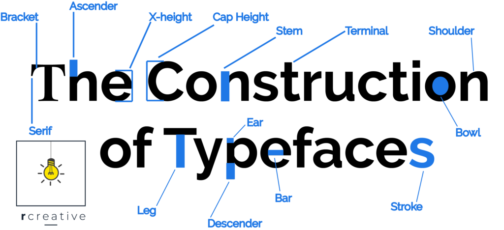
Think back to the days of kindergarten when you were learning to write. Remember how some parts of the letters “went to the ceiling”, “stayed on the first floor”, or “finished in the basement”? Well all those visual descriptions have more technical terms in the font and type world.
- X-height – The height of lowercase letters, specifically the lowercase x, not including ascenders and descenders.
- Arm/leg – An upper or lower stroke that is attached on one end and free on the other.
- Ascender – The part of a lowercase character that extends above the x-height. For instance, b, d, or h, have strokes that “go to the ceiling”.
- Descender – The part of a character that descends below the baseline, “finishes in the basement” like p, q, or y and sometimes uppercase J.
- Bar – The horizontal stroke in characters, usually at the mid-line like in H, or e.
- Serif – The extra projections that extend off the main strokes of the characters of serif typefaces.
- Brackets – The supportive curves which connect the serif to the stroke. (Unbracketed serifs are attached sharply, usually at 90 degree angles.)
- Stroke – A straight or curved line.
- Stem – A straight vertical stroke.
- Cap Height – The height of capital letters from the “floor” to the top of the uppercase letters at “the ceiling.” Most accurate measurements used with E which is flat at the top and bottom.
- Bowl – A curved stroke which creates an enclosed space, like in R, p, or b
- Ear – The small stroke that projects from the top of the lowercase g.
- Link – The stroke that connects the top and bottom part (bowl and loop) of a two–story lowercase g.
- Loop – The lower portion of the lowercase g.
- Shoulder – The curved stroke of letters h, m, n.
- Spur – A small projection off a main stroke found on many capital Gs.
- Stress – The direction of thickening in a curved stroke.
- Tail – The descender of a Q or short diagonal stroke of an R.
- Terminal – The end of a stroke with no serif.
The construction of typefaces is fascinating! By understanding the parts (like tails, spurs, loops, and brackets) you can identify a font. For instance, I was watching Hallmark and saw the text for the credits of a movie and I really liked the typeface. So I made note of some of the characteristics and then went on identifont.com and answered questions about it’s key features and found the font! Another website that is helpful for identifying fonts is fontsquirrel.com. At this site you can even upload an image and the program will identify your sample.
It’s worth some time considering what fonts to choose for you company or venture. Each style of typeface family says something about it’s design, use, and even history. Once you decide on a font, use it consistently in your print, web, and promotional work. Sometimes a font is what people remember!
Think about this: Popeyes, the fast food Louisiana style chicken restaurant uses a font in which the o in Popeyes looks like the cross section of an egg! Egg, chicken, not sure which came first but their name says something about who they are!
Have Some Fun With Fonts
Look around you at some text you like and make some notes about it’s construction using the list above. Then go to the websites mentioned and see if you can find the font. Once identified, create a logo, announcement, or note using the font correctly, whether it be suitable for a poster, invitation, report, or decoration.
Talk Fonts With Your Web or Graphic Designer
Next time you talk to your web or graphic designer, talk fonts! Be informed and use the knowledge you just gained from this article and your practice project. Include your font information when working with your web or graphic designer. If you are sending files, be sure to package your project and include fonts, or outline your text before sending. Just because you have a font on your computer does not mean your printer or web master has the same on his. There are thousands of fonts and different computer operating systems come with different fonts pre-intsalled. Know your fonts, talk type.
If your business or nonprofit doesn’t yet have set fonts for your branding, R Creative can help.
Every new website built through R Creative includes atmosphere design – including colors, typography, logos, and more. Contact us to get started.